This house went from so basic to total babe in only a few short weeks!
When the Kellys bought this two story, five bedroom cottage in Rehoboth Beach during the first year of Covid, everything that was in the house was included-- beds, chairs, dining set, and all the bad beach themed art and tchotchkes you could imagine. The Kellys are a cool, hip and busy family of four who love art, entertaining, modern style and traveling to places like Santorini and Italy, so they didn't really jive with the conservative boat/beach themed decor, bare walls, navy piped love seats, bright red cabinets and coral and turquoise textiles. No! IT ALL HAD TO GO! Tom had a big birthday coming up in June and Judy asked if I could work my magic by then and 'un-live, laugh, beach' her place. LOL. This house needed some love fast, so yeah! Let's get to work!
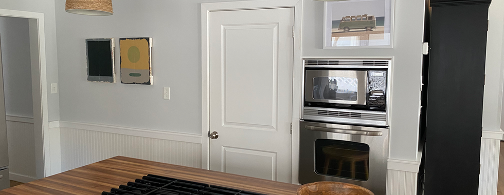
Here's the first floor before:
What we needed to do first was visit the house again and really understand what needed to stay and what needed to go. At the same time I also needed to assess the client's style and bring it into this house. So I started with a Pinterest page and we all started to contribute there. Once I established our style direction, I started building their Style Story in Slides and kept our mood board and ideas and links for furniture, vibe, and decor for each zone of the house so that we could stay organized and on the same page with each other.
The mood board for the overall vibe and style:

I wanted this house to embody all the amazing things we love about vacation without literally saying 'vacation' or 'beach'. To me this meant bringing in natural pieces, wood, leather, woven textures in the form of lighting, furniture and baskets, bringing in rugs with some patina and texture and creating a creamy palette that blends sand, shells and sky. I wanted to give it a more relaxed bohemian vibe without going over the top boho. When I think of Rehoboth, I think of dune grasses, loblolly pine trees, shells that are the darkest of blues and the palest of pinks, active skies that are sometimes ready to storm with that incredible mix of warm, dark blue/grey and a cool light grey. Our palette came directly from nature and from the Kelly's desire for coastal modern simplicity.
The mood board for the living room:

So, after going through the house with the Kellys via Facetime, we sorted out what needed to go and I was actually able to sell pretty much everything on Facebook Marketplace (it was and is always important for us to be sustainable in our projects—if we can shift unwanted stuff from one home to another means less to the landfill). I got started with what we would need to add and change. With the living room, we needed basically everything. Sectional, coffee table, curtains, rug, art, additional seating at the counter, ceiling fans, lighting. Maybe a change to the kitchen island and peninsula walls too. We decided the red cabinets were good pieces, but they'd be better in black, so Dru refinished and painted them. They really expressed that they wanted enough comfortable seating for the whole family plus the ever revolving stream of guests throughout the summer. They said they currently never hang out on the first floor because it wasn't comfortable, so our first order of business was to find the perfect sectional. I know what you're thinking: ugh! supply chain!—and I had to find the unicorn— comfy, the just right shade of off-white, the perfect heavy duty fabric that felt good even with shorts on, the right size piece to fit the space. I admit, it was a challenge, but I found my miracle at Albany Park. The Kova Sofa + Ottoman ticked all the boxes, including price and availability. We got it in less than 3 weeks (sadly, this sofa is currently 14 weeks out now).
The Ballard counter stools are the stools of my dreams. So wide! So comfy! Everything else was locally sourced. The amazing and super heavy cement coffee table was plucked off Ocean Boulevard's showroom floor, a lot of accessories came from locally sourced box stores—HomeGoods, Marshalls, Target as well as my local favorite The Brush Factory in Lewes. The pendant shades are from Lowes (believe it or not) and we decided to paint the inside of them with a grassy shade of chalk paint to give them a little more flair than the original white plastic. The art! We had so many panels with some pretty not so great art on them, so we repurposed them and painted new masterpieces over them. My husband, partner, and resident Art Director Drury Bynum created about 10 pieces of what we called 'surf art' that live throughout the house. They just really brought the vibe I was after.
What really helped move this house along was a willingness and drive to find as much as I could on the ground and ordering very little online. Luckily Rehoboth has plenty of shops to find a little here, a little there, some new stuff, some old stuff, some new stuff that looked old...it all worked out. I love how the Pewter Green (Sherwin Williams) turned out on the lower cabinets. It added that little extra layer that defined the kitchen.
The Living Room/Kitchen After
The dining room had a few issues. The good news was that we didn't need to find a new table, but the chairs were not great. There was also an area against the wall that was in desperate need of storage. We needed to find a cool, big ass, vintage rug that could define the space and not break the bank. We needed all new chairs as the current chairs were not comfortable. The Edison bulb-heavy industrial lighting felt dated and misplaced at the beach. I wanted to find a large wicker pendant and chairs that felt summery but were comfortable (and shorts friendly!)... and plants. We needed plants large and small but the kicker was they must all be artificial since the house is not permanently inhabited. Aaaand you've got three weeks left.... go!
The mood board for the dining room:

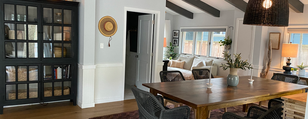
Lucky for me Rehoboth has Hunt + Lane — the coolest little beach furnishings shop. I was able to find, in stock, the oversized black chandelier and six woven chairs and the owner Tabor delivered them to us! Those guys really get it. A surprise addition came in the form of the slatted hutch I found from the cutest store ever called The Scene Shop and I happened to catch it on sale. I found the rug on Etsy at an unbelievable price. It came direct from Afghanistan and I'm not sure how, but it arrived in ten days! The large faux birds of paradise came from Target and it's a winner. I just elevated it a bit and put it in a basket with some moss. Overall, by removing the gym equipment, painting the dining area/nook the same color as the other side of the room (the living room), adding a large rug and moving the table over a bit, we made the dining room bigger and seamlessly joined it to the other half of the house. It's now a connected, very inviting space with soft lighting and comfy seating for all.
The Dining Room After
The final zone of the house is probably the most important— it's (a mom of two teens) Judy's 'nook', her chill zone, her 'me time' space... You get it. This is a little area around the corner adjacent to the dining room that felt forgotten. The seating was uncomfortable, the decor was just not happening... Judy wanted this area to be her nook for coffee time, margarita time, reading, relaxing, tv watching, whatever... and enough seating space to share with a kid or two, maybe. I needed to find a small sofa that was big enough to share but small enough to fit that nook. She also really wanted a single cushion style sofa, so that was another challenge. This time in walked Sixpenny. Another direct to consumer online furniture company who happened to have The Neva Sofa a.k.a. the most perfect beach house sofa everrr. It's 72", reasonably priced, ready to ship (at the time), slip covered in the most soft and drapey of linen fabrics and single cushion!
The mood board for the nook:

I found the vintage rug at my fave Brush Factory on Kings, Dru painted the other cabinet black and I added a stool for drinkies, a pouf for footsies, a few pics of the kids, some fresh art. a plant or two and we've got the nook of my dreams.
More to come on this project! We have just completed the second floor and I can't wait to share! That's next time... Drop me a line or comment if you have any questions about this project! 🤍
Juniper House is a full service interior styling studio helping clients realize their dream space. Contact us if you want us to help create your dream! hello@juniperhouse.studio


Comments